
 Old School here with a tutorial that I have saved from super obscurity from a web-site that seems to have seen it's best uses in 2005. This tutorial is re-published without the permission of Boltman and many of the original tutorial photo links are broken, leaving us with just this one, but I can tell you, for those of you who live to paint and convert that perfect model, the advice given here is the most genuine I have ever seen and it is the reason why I give Vincent Hudon the Artist of the Week for this week. You are my inspiration, Boltman and if you read this, hit me with photos and help me re-build this for the masses of hobby fans who drool over this kind of dedication to our little art form! And yes I know he is also known as Sylphid, the first winner of my Artist of the Week, but you know what, it is Khornemas and you don't want Blood Klaws leaving a big wet lump of bloody excriment in your stocking do you? That's what I thought, now, for the true hobby freaks, sit back, grab a coffee and prepare to read for a while!
The Making of Magmatrax By Vincent Hudon a.k.a. Boltman
As I promised when I started the project, should my Juggernaut project prove successful at the Golden Demons, it would be worth writing a tutorial about it. Little did I know this project would eat over 400 hours over 14 weeks. Most of these hours were spent looking at the model, adjusting the pose, revisiting the color scheme, and learning how to paint each element, taking 2-3 attempts for each new thing. I might not taken many step-by-step pictures on how to paint each element as I walking in the dark myself, trying to nail the effect I wanted. And when I did, it was already painted... Within a year of starting the hobby, I went from “applying paint” to converting and painting a model that would win the 2004 Canadian Slayer Sword. I wasn't half the painter I am now just before I started this project. It was a very long process, but as Jason Richards himself (an amazing Artist and Gentleman) told me at Toronto Gamesday 2004, once you know how to paint certain things, you just do it, it's much faster. This article is therefore meant to be more of a Walkthrough of my endeavors into making a Golden Demon-class model.It is a long read, but true to my form I wanted it to be thorough.
My wish is that this will serve as a source of inspiration to everyone, to demystify the whole Golden Demon elite painting thing. I am not the long time great artist. I wish to inspire other into believing that with a little bit of talent and a LOT of hard work and dedication, it can be achieved. Just undertake a project that's much higher than your current skill. That's the best way to learn and improve. Frankly, the Juggernaut was way over my skills, had I seen the end result beforehand, I would not have believed I could ever paint that. But with frequent questions asked to the resident painters at www.bolterandchainswordd.com and my favorite artists at www.coolminiornot.com , I raised my skills, and there is no reason you cannot yourself. Try hard, repaint it as much as you need to get it right, don't just finish your model and hope to improve on the next one. If you really are serious about painting a terrific model, step it up! You won't learn much by doing your next rank and file trooper which you've already done before. Challenge yourself! I have no background in arts, so if I did it, you certainly can elevate your skills to the next level too. I'm not a big time Golden Demon artist, I'm the underdog who worked really hard. Magmatrax, Champion of Khorne is the result of 25% talent, 75% hard work. Skill, I believe anyone can improve. The online community helped me learn, now I'm returning the favor.
The Concept
I wanted to make a Golden Demon-winning model. How? What to do? So I went online, and since I started the hobby I've been collecting pictures of fantastic miniatures. What made a winning model? Is there a recipe to winning a Golden Demon? Yes and no. Through reading articles by my favorite artists such as Cyril Abati, Victor Hardy and Allan C, chatting with multiple-GD winners like Mark Mosler (Anthraxus) and even the judges at Gamesday, I determined what were vague guidelines I was going to adhere to.
1- The most valuable thing I discovered is that your entry must be original. Sad to say, your interpretation of a Green Typhus model will have a hard time to score, even if it's magnificently painted, simply because there has been so many submitted already. Don't go for the usual GW color Scheme, and/or convert it to make it a new, never seen model. I wanted my model to stand out, make it something new and different, though clearly identifiable. As Mark Mosler said: “You see Magmatrax and the model punches you right in the face!”. You don't need flashiness, but an attention-grabber was what I wanted, I wanted people to remember my piece.
2- Not all models are created equal. Though it is true a simple model can win the judges over with the purity of its lines, I feel it's a toss-up when it comes to appeal to the judges. A termagaunt for instance, has less potential than a Tyranid Warrior, but not because bigger is better. Because, in my opinion, the warrior has more potential for you to “show off”. Of course, you want to make something you like, not what you think the judges will like. However, I'm a fan of the safer tactic, the “in your face big flashy thingy” models that draw attention. This is not to suggest this is the only way, but if your model is impressive and draws attention with the conversion, it's that much less you have to rely on your painting to pull off.
3- Conversion. Make your model your own, make it unique. It doesn't have to be completely redone like my Juggernaut, but the more different the better.
4- Freehand. Incorporate some freehand painting, something to show you can paint without lines and borders. This helps making the model your own, and shows you've spent effort on it. Magmatrax is not just a Juggernaut, it's the one with the magma scales effect on it's armor. Freehand further personalizes your model.
5- Make it flawless. I've heard that sometimes models are very close and often given 1st, 2nd or 3rd based on which has the fewest mistakes. This can be a big time sink, but if you can have someone else scrutinize your model for flaws you might have missed, you're that much closer.
6- Realistic expectations. Ditch that. If you cannot reach higher than you aim, you'd better aim very high. Think of a great idea, then think about how you would redo it if you had already done it once. Think of other good ideas, then pick your favorite. Make sure it's ambitious. If you don't win, you'll have learned a heck of a lot at least, and end up a much better painter in the end.
7- A friend to consort with goes a long way. Preferably, one who knows painting miniatures. For painting tips and opinions, and support on those long weeks where I was getting a little discouraged, my gratitude goes to Mark Mosler, Multi-winning Golden Demon winner no less. Watch this guy out, I smell a sword in his future too.
I had wanted to paint a Juggernaut, I thought the model had a lot of potential, though let down by a very static pose, and being a difficult sculpt to modify. I thought the Rider was just boring, and could be spiced up too. I wanted to use certain nice bits I had seen, and I had the vision of Archaon's chest piece as a rider on a more dynamic Juggernaut, holding a more prowling posture. This was my basic concept. I bought some Blu-tac (the blue gum used to hang posters), browsed for various suitable bitz and ordered them. Since my skills in sculpting were limited, I was going to use bitz as much as I could before having to resort to sculpting my own. I then discovered that Blu-tac was a dream come true to temporary hold pieces while you work on the posture, so I used plenty of it to get the feel of the model, and see how the parts could be matched.
The Conversion
The list of bitz I used:
- Juggernaut model
- Archaon's Torso
- Grimgor's left arm (WHFB Orc Warboss)
- Obliterator legs (the walking version)
- Berserker Head, shoulderpads
- Skull Beltbuckle from a regular Chaos marine torso
- Chaos Champion backpack- Ork Choppa arms
- Marneus Calgar's right Powerfist
- 8$ Walmart Jewelery chain
- Old Guitar Strings from a friend
- A few Skulls from the Unded sprue
- Round Toothpicks
Juggernaut Conversion
I had never seen much work done with Juggernauts in GD competitions, and now I know why. Though I felt the model had a lot of potential, I realized that the sculpt was horrible, with asymmetric parts, and badly sculpted finer features. I spend many hours just filing away excess and sculpting minor add-ons to try and make the model symmetrical. Even so, some things I couldn't pull off, like how the Juggernaut's neck collar has 3 spikes which are not evenly spaced. The collar wasn't actually straight, but that I fixed with GS. The model was not a simple case of cleaning the mold lines, but throughout it all, I still loved the look of the sculpt.
Archaon's chest turned out a perfect fit, the cape having a curve that married itself with the Juggernaut's rear right leg perfectly. The Rider was going to be bigger, but I wanted him to look like is was leaning on the Juggernaut a bit, reeling for the impending jump of the Beast unto it's prey. To accomplish that, the Juggernaut's body had to be much lower than usually mounted on it's legs, to keep the Rider low. The front Left leg would have to be cut and a joint added to fit the prowling pose, and complement the cape flowing on the other side. I decided to have the legs angled in a triangular fashion, wider at the base, to help accentuate the feel of the model being grounded and ready to jump. This also made the juggernaut wider and more imposing. The head had to become horizontal to keep with my concept, and at that point I found 2 horns that were just perfectly curved to make the Juggernaut look meaner.
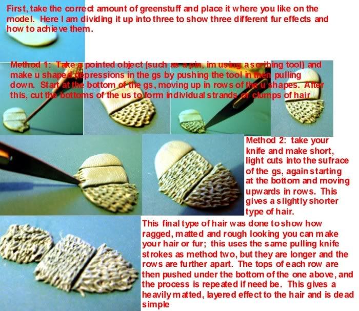
So piece by piece, I would convert a part and return to the blu-tac master assembly to check for fit. Needless to say I had to rebuild the Blue-tac assembly numerous times as it was sagging with each fit check. I started with the legs, first drilling multiple holes in the legs and body, and inserting half a dozen paper clip rods on each of the shoulder joint. With a gob of Green Stuff, I would stick a completed leg to the body, press to give the right angle, and use lots of Blue-tac to hold the position while the GS cured. The front left leg was sawed above the claw, then each part drilled, a continuous brass rod inserted on each side of the new gap, and glued with epoxy. I could then slightly bend the rod to position the claw, having checked rod length before gluing. Once happy, I made a rubber joint-type connection with GS where there was now a new gap, just like the leg joints on a regular Marine model. The 3 remaining legs would simply need to be positioned with paper clips like I did the first one, each time checking that the Obliterator legs I was going to use would fit well in between. This left me with a big ugly surface between the front legs and a gap at the read of the Jugger, between the legs. The front and rear legs were also farther apart that the original model. I came up with the idea of adding fur to cover these areas, which would also tie in with the pelt on Archaon's body. Thanks to Nexus's GS Fur tutorial (found here: http://img.photobucket.com/albums/v12/nexus17/afurtut.jpg,) I practiced on spare GS, and then sculpted fur on the Juggernaut model, and a handy filler which did not need to be a symmetrical feature, easy to cover large areas of sculpting..
The Rider had to be holding onto the Juggernaut, so I glued in each end of a jewelry chain, which each had a bigger link. I then GS'ed a link to the Juggernaut's collar. A strand of the chain would be glued on the fur and the Powerfist would then be glued on top, but the other end was left loose, as I wanted it glued inside the clutched fist, to make it look like the rider was holding the chain.
The head was a lot of work, mainly because the Stock Juggernaut model doesn't have a neck. I cut the neck off, saving the neck collar with 3 spikes to glue back on the body. I then drilled a hole in the body in the middle of the collar, and one at the back of the head underneath the Collar of Khorne on the head. I then used a brass rod (well mine was iron wire) cut to proper size to join head and body. I positioned the head actually lower than the body, to emphasize the prowling pose of the Juggernaut. Again, I would refer to the Blue-tac master assembly time and time again to adjust the position. I epoxy glued the rod in the head, then once dry, made final adjustments and glued the other end of the rod in the body. Next was time to make a neck. Made a few sketches, tried on spare GS, and then put a gob on the neck, working from under the model. I sculpted wires and such, continuing what little was suggested by that very small part of a neck provided with the model. Once dry, I bent Guitar strings to a proper shape, guitar strings being very stiff, I did not have to worry about loosing the shape, and I used GS to attack to the head and the body. I made sure to give the guitar strings a different bend, being more curved on the left side of the Jugger, since that leg was leaning forward, the cables close by were of same length, but restricted in a smaller space. It's all in the little details. I'll mention it here, but through the painting process when it became time for the eyes I decided the stock model's were too small. I therefore cut myself a piece of plastic sprue, drilled only 2 mm through an end and beveled the plastic around it.
The slightly spherical tip of the drill bit would make a perfect rivet-type stamp to make bigger eyes out of GS, which I then stuck over the tiny original juggernaut eyes.
Checking with the Obliterator legs, the original saddle was much too small and deep. I simply filled the original gap with GS, and texture the surface like a leather seat, with a diamond-shaped pattern on the sides. I glued on tiny metallic studs made out of cylindrical pewter flash from another model. I made sure to round the surface with a file before each cut was made in the pewter flash rod, to make a better painting surface later on.
The Base
I wanted the Juggernaut standing atop the battelfield, looking at the puny mortals soon to be crushed. I found a natural rock, which size and shape suited my model well. It had a cleavage cut, too, from which I could exploit the recess underneath to show off my previously acquired glowing lava-effect. I had to pin the juggernaut to the rock somehow though, for solidity. I couldn't drill through the rock, but I figured I could add features with Milliput., a two part putty which is more like clay, whereas GS is more plastic. I added gobs of Milliput on the rock to improve it's features and make it match the Juggernaut's pose better. I needed an outcrop for the front left leg to stand on. I also needed a little extra thickness for some legs to be able to place pins in the base for solidity between model and base. I did so for both right legs, as the rock was thinner on that side. I pinned the Juggernaut paws, and pressed it in the wet Milliput to leave an imprint, but removed the model, which was going to be painted separately. On the extra putty features, I used a broken piece of cork to press on the putty and make texture to work with in the painting stage.
Later, when the Juggernaut was finished and it was time to paint the base, I went back with some putty to exploit a recess in the rock to make a little pool of lava emptying itself a little lower. (back right side). I also added A few skulls to tie in with Khorne and fill an otherwise simple base. The area I had left untouched in the alcove for lava felt like it could be improved. I decided to simulate bubbling, thick lava, and found that the little ball on the back of a SM where you glue on a backpack was just right for the task. I also used a round plastic ball on a leftover sprue for a bigger bubble, and some rigs cut from a smoke launcher nozzle. The smallest burst bubbles were made with a grenade clip, cut in half thickness-wise. Very small, be sure to hold them down when you cut them, or you'll have them bounce out of your sight and loose them.
The Champion
The Champion is where I realized how handy it is to carefully select bitz. I cut off the obliterator legs, and quickly realized that it was a perfect match. On the left side the leg was open outwards, which worked well with my Champion's pose, Turned on the left side and holding that Huge axe. The spacing between he obliterator legs was also a very good fit for the Juggernaut width and required no bending. I simply filed off the fleshy bits from the legs, using once again my mighty rotary tool to grind away. I also sculpted treads underneath the boots, in case the GD judges would look.
Now this is where countless checks with blue-tac took place to assert the pose of the champion as each element was gradually glued in. I used the rotary tool to grind away Archaon's shoulder armor, peeping from under the pelt. Starting with the Right shoulder, this was a very long grind and check procedure, until I could fit a complete Berserker shoulderpad. Remember to use a mask, pewter particles are bad for you! I then cut off an Orc arm at the elbow, pinned it in the Torso, and pinned the other end to Marneus' Powerfist, previously drilled between the thumb and fingers to insert the chain form the Juggernaut's neck. I also had to cut off the ammo clip form the bolter that was in the way of my Juggernaut's right leg. Nothing was glued at this step, just using blue-tac whenever necessary for the parts to hold while I fit them. I went back to the torso and legs, drilling each, and pinning with a piece of rod, cut to length, then glued, and finally bent to appropriate angle. I also drilled a hole in the obliterator legs and glued a paper clip in the saddle. This pin and hole would allow me to pit the champion on the juggernaut at the same place every time I put it on for fit.
Torso and legs now being one, I could glue the right arm on the torso, underneath the shoulderpad with epoxy, and let dry overnight, champion on the juggernaut. Then I worked on sculpting a midsection between torso and legs, and came up with GS trims with studs made in the same fashion as the Juggernaut's eyes, to keep them the exact same size.
The left arm was trickier. I knew it was going to be something the viewer looks at instinctively, so it had to be suitably impressive. I oversized the weapon with an Orc knife as the main blade extension, and reversed part of an Orc axe to complete the other side. Since the plastics were thicker than Grimgor's axe, I used greenstuff to ease the transition. Filing down the plastic knife and axe would have lost the facets of the weapons. I added a toothpick tip on top for good spiky measure, and another knife blade at the bottom of the are handle, to make it a handier weapon for a rider to wield. I finally superglued one end of a cheap jewelry chain on the axe head, wrapped it around and brought it down to the bottom of the pole for looks. Now I had chains and fur on both the rider and mount, which helped emphasize the cohesion of the model.
Next was the left shoulderpad. Since there was going to be too much grinding involved, I tried a new approach: only adding the visible part of the shoulderpad. It proved tricky to match to the fur, and in the end, I only used a little bit of a pad, stuck in there with GS which I sculpted the missing parts to smooth the pad with the fur line. I drilled underneath again for a pin to attach the axe arm with. Once the arm was glued (using epoxy and a profusion of blu-tac to hold in place while it dried,) I finished the connection with the body with GS. The backpack was then stamped on a gob of GS stuck on the back fur, and removed for the GS to dry. A paperclip was used as a pin, but the backpack kept separate for painting. Finally the head, another focal point. I really liked the Berserker head I used, and didn't feel major conversion was in order. I simply added a few toothpick spikes on the head for a little more cohesion with the Juggernaut's spikes. I glued the head in a forward position, and then sculpted a collar our of GS with stamped studs, and that was it!
To this point the complete conversion took about 50 hours.
Painting Magmatrax
Now was the toughest step for me. I felt more at ease with converting which I enjoy a great deal, and the painting I knew would force me to step it up to live up to the conversion which I was very proud of. I knew I wanted a Magma theme, which would tie in with the rest of my army. Oh yes, this model was going to see battle. I'm too slow a painter to afford painting something that I won't use afterwards, as I want to get a full sized army finished and play the game which I enjoy. I decide I would go for a cleaner, flashier look for the model, it is a style I like, and quite frankly, it is the only style I had any experience with. The model was Khorne, and thus called for Bone, reds and goldish colors to keep with the ethos. Yet it had to be original and not just another red and gold model, like every other Khorne Berserker. That's when I cam up with a “Magma scale” pattern, which would make it original and take care of the Freehand aspect of my entry.
I also wanted to try out Non Metallic Metal (NMM) gold, which I had seen in admiration on other models at CMON. The Sky-Earth NMM was a variant, which really made things shine, and I decided to step in unknown territory and aim for the toughest thing I could. Previously, I had stared at countless examples of models with NMM, asked questions to some of the artists, and began to get a feel of how colors were supposed to be applied on various surfaces to give the impression of shine. My basic color scheme set, I decided to start with the right rear leg of the juggernaut. As it was going to be partially covered with the Rider's cape, I could get some practice in without it showing on the final model. I also decided to change my approach to painting, and concentrate on 1 element at a time, that leg for starters, and fully paint it before I moved to the next element. You get to test a particular effect and see the end result of the color combinations right off, instead of waiting until you finished the entire model and realize you don't like the result.. It also allows you to get more familiar with a region of the model and ensure you tidy up all the little painting flaws.
On with a Chaos black Primer coat, after washing the model with soap! Gets rid of finger oil. My 4/0 sized paintbrush will handle all the main coats and highlights or the red armor, and my trusty 10/0 paintbrush will handle all the detail and NMM.
General Tips
1- I had heard that you should dilute your paint. I somewhat did, but never enough, in perspective. When I realized that properly diluted paint makes smooth transitions in color MUCH easier, it clicked in my head. For this, I prepared a little bottle of dilution water, which is about 15% Future Acrylic Floor Finish and 85% water. More Future made bubbles, and less made a lesser effect. This stuff makes the paint more fluid, it tends to dry less chunky, for smoother transitions. It's a bit like using dishwashing soap in your ink washes. Breaks surface tension and makes paint application smoother. Whatever I painted, I diluted beforehand on a palette, with at least 1 part water to 2 parts paint. Depending on the technique, It could go to 15 parts water to 1 part paint. More on this later.
2- Use a palette. This was another big discovery for me. I discovered using a piece of plastic to put paint of all the shades I needed for an element. For NMM gold, I did one little trim at a time, with a bit of all the colors I needed on the palette, available to touch up and finish what I'm painting. That opposed to doing all the trim base coats, then take out the next color for next stage, etc. You waste a little more paint, but results are better, and the actual painting is quicker, all colors available right away. Be sure to periodically add dilution water to your paints to slow down the drying on the palette.
3- I used Vallejo Game Color paints, but mostly because I find their bottles smarter. GW paint I find is pretty much as good and have no problem working with it, actually I did when the appropriate color was closer to hand that the VGC container was! VGC has, however, an edge with smaller color pellets in the paint, which makes smooth layering easier. I will use GW color names throughout the article for easier reference, but in fact I painted mostly with VGC. I recommend their Vallejo bottles because they are more suited to dropping a little paint of each color you need on a palette.
4- Don't be afraid to go back and touch-up. I had to do it countless times over, with each new element that needed paint I had to learn how to do it. Skulls (always had a hard time getting the right colors), Fur, Magma effect, spikes and horns, NMM gold, NMM steel/silver, how to paint a chain... Took 300-some hours to paint it all, but now I know how to paint each of these elements, and I could do the whole model in half the time now.
Painting the Magma Scales
Using: Chaos blackScab redRed goreBloody redBlazing orangeGolden yellow
I started off by painting the magma scale on the right hind leg, giving me more freedom to try on an area I could repaint and repaint again as it was going to be partially hidden under the cloak. I started highlighting the armor in red, and then adding a scale pattern, but it looked slightly off, as the lava veins were too similar to the highlighted areas of the armor plate. Ok, let's try something else. I darkened each scale, which improved it. Redefined the lava veins... better. Highlighted the scales a bit, and voilà! Finally the effect I wanted. This was going to change a bit as I progressed through the surfaces though, so here is my finally honed technique for the scales:
Basecoat of scab red is in order. I tried to avoid overpainting on the gold trim to be, but no big worry, we'll fix it later. Since the paint is slightly thinned, 2 layers are necessary. Next, I take blood red and draw fairly wide veins intersecting each other, to create scales. The blood red doesn't cover much with one layer, but it doesn't matter at this early stage. Next, a second layer with blazing orange, slightly thinner than the first layer, to leave a little bit of the red on each side of the veins. Still using thinned paint, roughly 30-40% water, if orange didn't cover enough I'd go back. The orange needs to be covering the scab red fully. Then, only where the veins intersect, a very thinned down golden yellow is applied, at about 50/50 water / paint. The trick is to apply the paint with the paintbrush starting a few millimeters away from the vein intersection and drag your paintbrush toward the intersection, lifting the tip off the surface at the center. Thinned paint will be therefore very thin where you started your stroke, and accumulate where you took it off. Paint will slowly travel down the wet path you made with the brush. With the right dilution, paint will dry with a gradual thickness, giving you a smooth transition from no yellow over orange to almost full coverage of yellow. This will require some practice to get perfect, but a few trials will bear the understanding of this technique, which I will henceforth call “wet layering”.
Each vein leading to an intersection must get this wet layering of yellow, to give the impression that underneath the scales, there is a hot spot. If you observe real lava, you'll notice that warmer spots are at the center, with brighter colors. The more veins and the more lava around a certain region, the warmer it is kept. The borders of a lava flow are darker, cooled down from exposure to the next medium, air, or rocks for instance.
Now the scales must be redefined. The blood red and orange has spilled over the original intent, so red gore is reapplied to redefine the perimeter of each scale. Red gore is brighter than scab red, and the color brightening is useful, yet still subtle. Paint should not be more than 20% thinned, as we want it to make a clear and precise line from the lava veins. I also made the scales larger at this point, giving them a slightly more round shape, extending the straight borders further over the veins in a curved fashion, but not avoiding the vein intersections. By now the scales are looking pretty good. The final touch it to manually apply yellow at some of the intersections, reaffirming the presence of the brighter color, but not every intersection; lava is a random pattern, and I found that leaving some intersections a little more orangey than the others helped the effect.
Finally, the shading. This step can be done after the NMM trims are done, as the effect will be a lot more visible then against a black trim. Regardless, here's what I did. After reading a few precious articles from Cyril and Allan C, I suddenly clicked when I read the mention of “colored water”. I wanted to shade the magma scale armor as a whole, darker towards the trims. and any other feature. To this avail, I mixed a very small amount of scab red and black paint (33/67) with a huge amount of thinning water, at a ratio of 15 or 20 to 1. The idea is to end up with tinted water. It's blackish, but you can still see through it very well. With the 4/0 brush I would apply the watery mix over the magma scales around all the edges to the gold trims. Once dry, there is no apparent change. Let's do a second layer. Once dry, perhaps a hint of darkness shows over that region. Now the trick is to apply more and more thin layers of this colored water, on a successively smaller area, towards where you want it darker, in this case towards the gold trim. This very wet layering uses so little pigment of the paint that the layers you paint on don't show at all, giving a very good transition to darkness. It also helps to bring out the NMM gold features, or any detail surrounded by the darkened area.
It is very important that each layer is given time to dry before applying the next or you will break off the previous layer, and create “tide lines” of darkness which you can't really fix unless you start over. To get a good gradual darkening effect, usually about 10 layers were required. In the end, I thinned down black to about a 60% water to paint mix, and blacklined the magma scale armor plate to separate it from the NMM trim. After the darkening though, it was already pretty dark there, and only a quick stroke with black paint was required to define the surfaces. Note that I did not use inks for this. The benefit is that colored water can be made out of any color, and is less harsh and prone to making tide lines like ink will. In a way, colored water is more forgiving that inks, which would have to be diluted even further.
Whenever the surfaces called for a different type or material, I blacklined it with heavily thinned black paint. Being thinned (with Future floor wax finish), the black paint flows and stays in the lines easier. This gave a crisp clean look to the model, something I am fond of.
Painting the Plain Red Armor
Using: Chaos black Scab redRed goreBloody redRed ink
Over the black basecoat, a thinned down version (35-40% water) of scab red is applied, in the same manner that yellow was dragged on the surface of the veins. Start the paintbrush at the darkest recesses, and drag the paint towards the brightest edge you want. In my case this generally meant starting from the top trims to the bottom ones, away from the overshadowing magma scale armor plating.
To explain this, lets take the right frontal leg of the juggernaut, right underneath the lava scale plating (leading to the claws). I apply the paint starting up on the leg, and I drag the paint down with the brush towards the claw, using this wet layering technique. Since the paint is diluted about 40% with water, little color will show at the top and more paint will end up at the bottom, this shows even more on a black basecoat. Let it dry a few seconds, and repeat the process. This time, I start putting paint maybe 1 mm below the first layer I just applied. Now this second "wet layer", once dry, won't appear to cover much either, but a little more than the first. I'll apply a third layer, again starting a little below where I started dragging the paint the previous time. Don't be afraid to step out of this procedure, as I did. Sometimes the layer was just too thin, and starting a second layer a little below was premature; I'd simply do another layer starting wherever I thought the change black/scab red was too drastic.
Now it's time to brighten the color. I'll mixed some red gore in the scab red, re-dilute with water, and apply a new layer of brighter, thinned paint, starting a little below the last scab red layer made, spreading the paint towards the claw once again. I kept this process going, with a couple layers of each color mixes. I used pure scab red, 50/50 mix scab red/red gore, pure red gore, 50/50 mix red gore/blood red, until the last few layers I applied were actually very short, close to the claw, in pure blood red. I actually started with scab red, added some red gore about 50/50, then more and more red gore, then eventually blood red, periodically adding dilution water to keep the mix thin and fresh. The final hilight layer is actually blood red with a touch (10-15%) of skull white. More than that would look too pink. Don't worry about actual color mix quantities, is you apply gradual, thin layers by dragging them towards the brightest regions, you'll end up with the same smooth(er) transition.
How smooth your color transition, or "wet blending", is will depend on how you mastered the art of diluting your paint just right (comes with experience). It will also be better if you use 15 layers throughout the surface instead of 3-4, and the more numerous the shades of red you used along the way, the better. The Juggernaut's leg, for example, was made with 5 different shades of red, done with about 15 layers (3 each roughly). And remember, once done, if a particular region of the transition jumps to a brighter color too quickly for your tastes, use the colored watered technique, with a shade of red that is darker than what you are trying to fix, and apply to gradually darken the area. Be patient though, it takes a lot of layers to make it really smooth, and it has to dry in between. When I could, I would darken a bunch of adjacent areas, and by the time I was done, the first place I darkened had dried up and was ready for another thin layer of colored water.
To help bring out a nicer candyish red, thinned down red ink was applied all over the red armor. I preferred using 2 or 3 layers of thinned ink than a heavy one, because the ink will blur the various shades and diminish the difference in shades you have just applied, which you don't want. Ink is just to give it a tint, mainly to change the blood red color, which is too close to orange for my tastes. It also has the benefit of improving the blending effect. That extra tint, which can also be achieved with any color you thin extremely to “colored water” will hide a little bit of the layer transitions.
Non Metallic Metal Gold (NMM Gold)
Using:Scorched BrownVermin BrownLeprous BrownLight Yellow #010 from Vallejo Model color range; similar to 50/50 white golden yellow mix
Alright now, the most learning I did here. NMM had stirred amazement, wonder and a certain deal of fright since I first saw the Master's results. It looked incredible to me, and it looked impossible to achieve. Well my friends, it isn't as hard as it may look. But it's definitely something you should attempt only after getting a good grip of the wet layering described in the red armor portion of this article. I did a lot of searching and observation on this, and here is how I painted my interpretation of NMM gold.
First, there is no perfect way to do it. To each their own color picks. I chose mine from the lists of Bolterandchainsword.com's renowned Commander Y (Tom Shadle) and Mahazael, the Demon Prince Master of coolminiornot.com. There are a variety of colors to pick, and the technique is the same for NMM silver or brass, but you'll have a very hard time achieving results you like unless you have the right colors for the look you wanted. I wanted my NMM to be shiny, bright, to contrast with the darker red armor. Not too sure myself if it would work, I had read that Gold would never reflect perfect white, it's just not in the tint of the metal. Some people would use beige to brighten the brown and make it look gold. Others used yellowish to make the gold shine. I picked a yellowish color, but something between beige and yellow. Too yellow isn't good, as it will look like yellowish metals, not actually gold, which draws it's shades in the browns. If your attempts end up looking yellow, then you are using too much pure yellow, and should stick in the leprous brown color ranger longer before going to light yellow for the final brightening.
Colors set, the next and most important thing is understanding the way light reflects on metallic surfaces. I have no background in arts and therefore lack the proper theory to explain here. I am, however, a very good observer. I spent hours upon hours searching and scrutinizing pictures of well made NMM models, the ones I though had achieved a good reflective effect and caught my eye. Most of the hundred or so pictures I kept were found on coolminiornot.com, from browsing countless high scoring models. I began to get a feel of how reflective surfaces could be painted to mimic reflections and give it a shiny appearance. It's hard to explain, it's just something you eventually understand, from seeing this type of surface at this particular angle from the light source, painted this way. I can however teach you how each type of reflection was made on Magmatrax, and hints as to which situation calls for which effect, to the best of my humble observations.
Sky-Earth NMM Gold (SENMM)
Certain golden areas are sufficiently large to show off with some shinier gold effect. Or perhaps the area is small but you really want to make it look like it's polished, super reflective gold. That's when you use the SENMM technique. The idea is to simulate the reflection of the horizon, where sky and earth meet. Have you ever looked at a shiny chromed hubcap? Pretty much everywhere the car is parked, you'll see a horizon line, be it from sky and earth meeting itself, or another such drastic color transition from dark to light, like the sidewalk and the building behind it. To fool the eye into recognizing the horizon in the distance reflected on the metal, you use this technique.
I always started with a basecoat of only slightly thinned leprous brown. (20% water). 2 layers would usually suffice, but don't worry if the surface is not perfectly covering the black undercoat, as there will be many more layers applied. Take scorched brown, normally thinned around 1/3 water and paint a horizontal line on the surface. From this starting point, I paint the entire area underneath scorched brown. Next, I use light yellow to paint directly over the horizon line. I can also use this step to even the horizon line made with scorched brown. With this feature as bearings, I then slightly brighten the dark zone under the line. Starting from the very bottom, I'd use 50/50 thinned vermin brown and apply paint from the bottom, brushing sideways. When the horizon line is high up on the surface, vermin brown won't be sufficient: the color has to become brighter. A 50/50 mix of vermin brown/leprous will often suffice, but for those really large areas, you might have to bring it to full leprous brown. Next, over the horizon, I would go to the highest area of the surface and paint leprous brown. Then, successively, mixes of leprous and light yellow, 50/50 thinned with water, are layered horizontally. My best advice is to have all 4 browns available on the palette, diluted 50/50 with water each, on your palette. That way you can mix various concentrations of paint for your mixes, which comes particularly important in the leprous/light yellow transition. Put a layer in between leprous and light yellow. If it's too dark, just add more light yellow to the mix on the palette. Too bright? ...well you get the idea. A lot quicker to adjust the layering for a smooth transition. Just remember to add thinning water periodically. And if your horizon line is particularly low, the top color will tend towards vermin brown. But don't go to scorched brown as it confuses the eye which you need to fool into associating dark brown as the earth line. Same with the bottom of the earth zone, don't go to light yellow too much as it is reserved for the sky region.
Now that it's all painted, it's time to “hilight” the very edges, the rims of the metal surfaces. For this you must remember that the brightest rims are perpendicular to the light source. And as the rims tend to be parallel to the light rays, it reflects less and less of the light. So, if you take the armor shell on top of the hind legs of the Juggernaut, the very top of the gold rim is light yellow, and as the curved line goes down, the very rim goes from light yellow to leprous brown, and then no hilight at all. This also means that the underside trims should get no hilight of such at all, since light is above the metal. However, at the very bottom of the metal trim, a little brightening is in order, with a very thin layer of leprous brown (always thinned) and then an even smaller line of 50/50 mix of leprous and light yellow. This you apply, like the top rims, using the side of your paintbrush, only grazing the edge for a very thin line.
Knowing how it's done is not enough, you must also know where to do it. In the case of SENMM, your horizon line is the starting point. That starting point should however follow a simple rule. If the surface you are painting is perfectly vertical, then your horizon line should be right in the middle of it. However, if the surface is tilted up a little, then the horizon line should be lower on the surface, the more tilted the lower the horizon. If the surface is tilted down, then the horizon should be higher up. Best way to figure this is to take a mirror and check it out for yourself. If you tilt the mirror up or down, you'll the features reflected in it move down or up, accordingly. In reality, it doesn't take a big angle for the tilted surface to only reflect the sky or the ground. For miniature painting, I found that the horizon line helps to show off reflection, and you'll want to put that horizon in, and only avoid it when the surface is really very tilted.
The cylindrical features are done in the same way, but the horizon line has to be alongside the length of the cylinder for the best effect. Furthermore, to accentuate the drastically curves surface, the scorched and vermin browns are very scarcely found, accentuating more on leprous and light yellow. The horizon therefore goes from scorched to vermin to the normally unused leprous and finally a 50/50 mix of leprous and light yellow.
The horizon line might not always be horizontal. On curved surfaces, or surfaces tilted both on the vertical and horizontal axis, the horizon may end up diagonal. Magmatrax's waist gold trims are an example. For one thing, on such a small surface, the horizon line “horizontal” would be ackward (and too small). Instead, the transition was made vertical, though the light yellow for the sky transition was applied from the top rim, brought down at a slight angle and then continuing at the bottom of the trim towards the backside of the model, in an “S” figure. I lack the proper explanation, but in this case, from studying many models, this technique clearly shows the eye that it is a reflective surface.
NMM Gold trims
Most of the Gold on Magmatrax was simply done as a NMM gold trim. The area is painted in the same fashion as the SENMM areas, color-wise, with the following considerations. Generally speaking, a NMM trim tends to be hilighted in reverse to regular surface, bright at the bottom, and dark at the top (assuming the light is at the top). However, the very top rim is hilighted with your purest, brightest color, light yellow in my case. So I start with a leprous basecoat (2 coats thinned), then scorched brown in the upper part, covered almost entirely with vermin brown. To get my bearings, I would then paint a 50/50 mix of light yellow/leprous brown at the very bottom of the trim, and then blend the colors in between, using strongly thinned mixes ox light yellow and leprous brown, and then vermin/leprous mixes. Your paint should be thinned down 50/50 with water for a better transition.
To get a good NMM effect, it is essential that your color transition is very smooth; you cannot see layers. To practice, I suggest using very diluted paint, ½ to 2/3 water at first, only applying a small amount of diluted paint, and then adding successive layers of various mixes to fill in the color gaps in the transition. As you get familiar with this technique, you'll pull it off with less water in the paint, at a faster rate. The first few trims literally took me hours to do right. But it gave me experience with paint thinning, and amount of paint in the paintbrush required for best application.
Painting the studs had me discover that a simple SENMM technique could be used to great effect. Aiming for the sky, I kept my motto strong: “No shortcuts, make everything as intricate as possible and go the extra mile, every time”. So I decided to paint every last one of the studs (over a hundred in all) scorched brown, and very carefully paint the lower 1/3 leprous brown and the top 1/3, light yellow. Paint was only barely thinned (10%), as the paint needs to stick and cover. Besides, thinned paint on a stud tends to gather around the stud, which is a big no-no. For best results, I made sure to leave a scorched brown lining all around the studs. The biggest studs also got a very, very small touch of pure light yellow thinned down as usual (35-40%) at the very bottom of the stud, leaving most of the leprous brown showing. Small zones of color as such might not seem worth the time, but for the overall piece, even the slightest hints of color will show. Just like the smallest error in color transition will haunt you until you fix it.
I didn't have time to read tO now, but is there a Brushstroke analysis in there/
ReplyDelete